
How we made an iPhone app on the side
(and a few tips to help you do it too)
There are lots of reasons to try something new, but for me it always boils down to curiosity, restlessness, and discontent with the status quo. If you’re the fidgety type, you know how it goes: when you’re not challenging yourself, not feeling some level of discomfort, you’re not really alive. You’re just a husk of a human, aimlessly burning energy.
About two years ago, Trevor and I were feeling this way and looking for a new weird thing to do. On a lark, we decided to try making an iPhone app in our spare time. We overconfidently declared we’d make a weather app and do a better job than the apps already out there. (A tall order indeed…there are hundreds!)
Results came at a snail’s pace, but we instantly found the value in exploring new problems and materials. These experiences don’t just expand your skill set so you look more qualified to the creeps on LinkedIn. They carve extra wrinkles into your brain and change how you think forever after.
In the end, two years later, we launched Hello Weather and came away with some extra smarts. It’s a tiny thing, but it turned out useful and sweet.
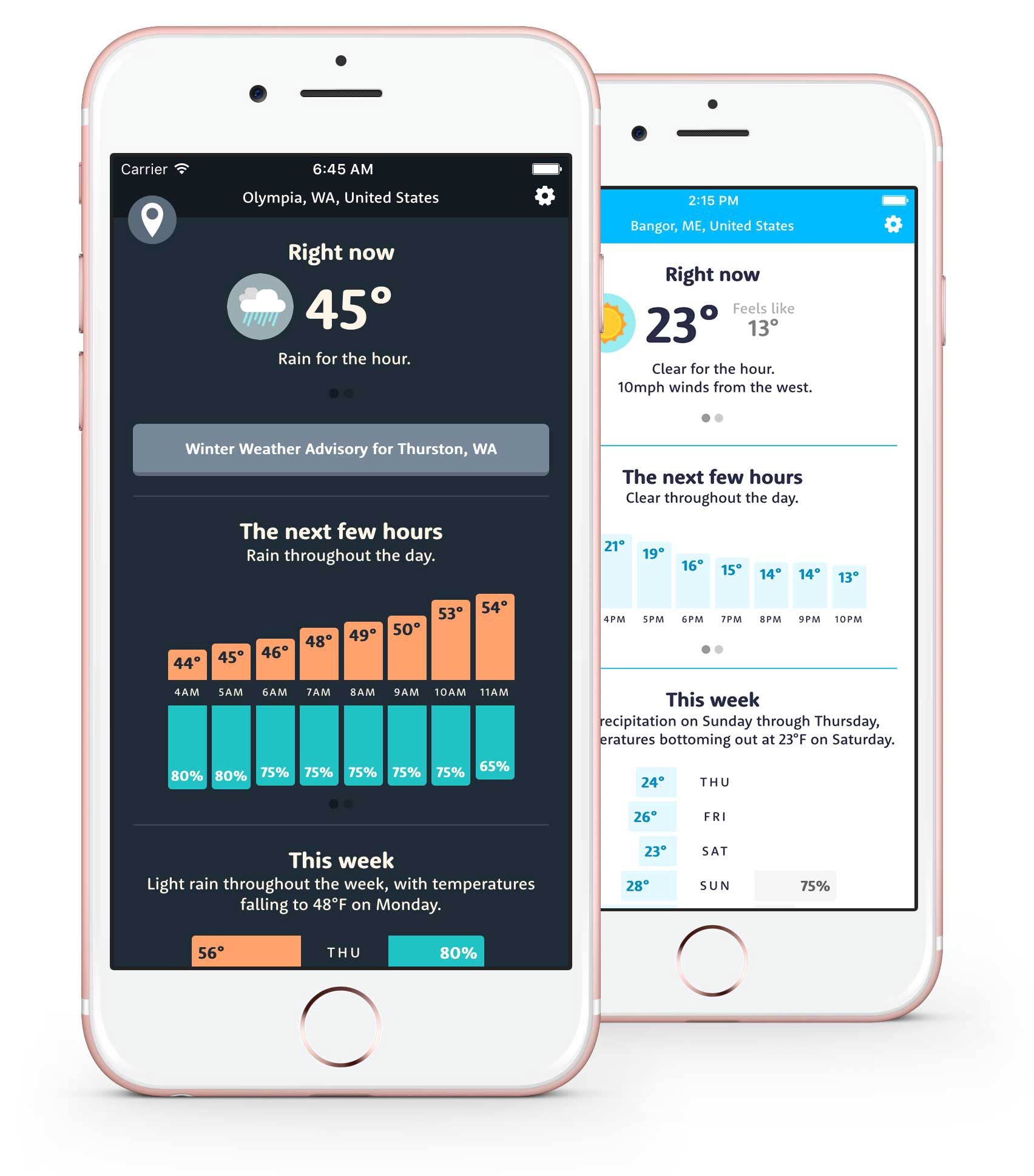
Here’s the tale of how we got it done—eventually. If you’re just starting out making apps, this is a small sampling of what you’re in for. (Or if you’re an old pro, send this post to your uncle the next time he asks you to work on his “really easy” app idea.)
Phase 1: Uneducated guessing
Initially we knew nothing about the weather or iPhone apps, so we were completely winging it. I had a theory that we could show temperatures and precipitation on the same axis side-by-side in a chart. I sketched it.
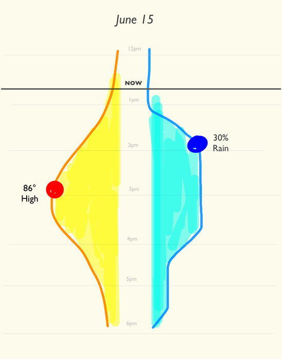
Amazingly this idea worked, and we kept it almost verbatim in the final version (though we changed the chart style to bars instead.)
Phase 2: Fake it till you make it
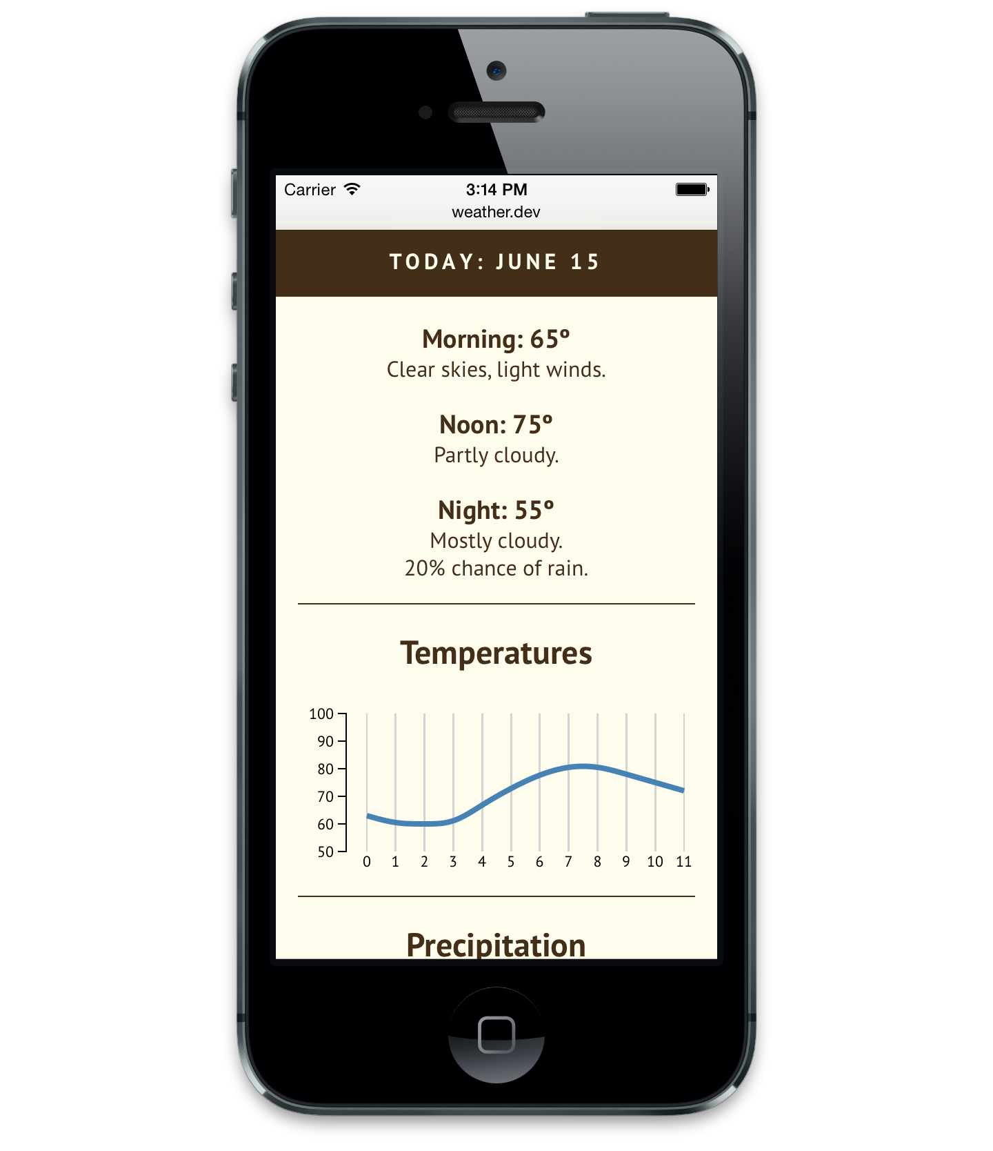
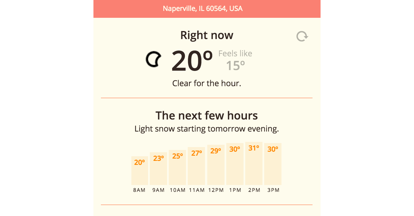
When you set out to make an iPhone app, you should jump in to Xcode and start learning Swift, right? Well, maybe…but we didn’t. We lazily did things we already knew how to do first. This meant making a Rails app that showed weather info on a page optimized for a phone. That way we could use it right away as a home screen web app (remember those?!) instead of the other 40 weather apps we already had and disliked.
Phase 3: Find The Meat
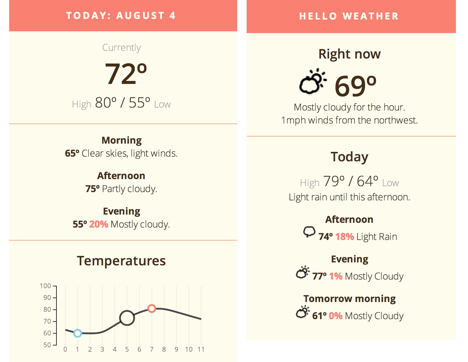
In 37signals parlance this is called epicenter design, but I kept thinking of it as Finding The Meat. We worked like copy editors, carefully selecting what information was essential. Our mission was to show the most contextually relevant info on one screen, and shove everything else off to a secondary view, or cut it altogether. Each data point had to fight for its life.
Phase 4: Taking Shape
By the end of 2014, 6 months after we began, we had the beginnings of a native app (which was still just a UIWebView wrapper.) We also had a name, an icon, and the final bar chart style. We gave the app to a few friends so they could tell us what they liked and didn’t like.
Phase 5: Trying Stuff
We noodled around with lots of different ideas. Some features found their way in, but we tossed out almost as much as we kept. Here are a couple of things that didn’t work out.
Weekly Forecasts
For a while I was unhappy that the 7-day forecast chart didn’t show low temperatures, so I tried jamming them in, but it wrecked the elegance of the 2-sided chart. It turned out that low temps rarely matter anyway, and they weren’t worth the extra complexity. (Remember: ruthless editing!) In the final version, you can just tap the temps to toggle between highs and lows.

Multicolor Bars
I thought it’d be fun if the bar colors changed based on the temperature they represented. Fun…Yes. Confusing? Also yes. We killed it immediately, but this idea came back later as hot/cold themes for the app itself.

Phase 7: Making a real #$&$#(–ing iPhone app
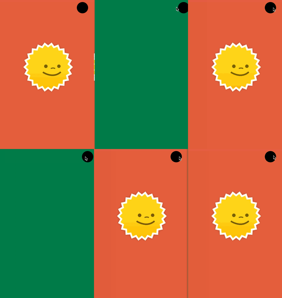
For over a year we coasted along with the plain web view. We finally agreed to make more of the UI native, so I took a couple of nights to learn Xcode and Swift. At first I struggled with Xcode’s IDE GUI smorgasbord, but eventually got the hang of it. I figured out enough to stub out the interactions in the app, so Trevor could hook it all up.
Phase 8: Making it work
By now Trevor was ready to dig his heels into iOS programming, so he took all my UI stubs and made them real. He added important functional things like pull-to-refresh, load state handling, and reordering locations.
P.S. we didn’t do this purposefully, but it was awesome having the designer (me) kickstart the app's interface directly in Xcode. I got to be pedantic with all the visual nits, and Trevor didn't have to waste time interpreting a theoretical mockup. I also learned all about Apple’s stock UI widgets, so I wasn't coming way out of left field with hard-to-implement ideas. Xcode is finicky and overcomplicated, but it’s not THAT hard to pick up. Highly recommended for any designer!
Phase 9: Marketing and App Store Mumbo Jumbo
You’d think making the app would be all she wrote, but no! You also have to submit it to the App Store, which is a hot mess of screenshots, certificates, beta testing, rejections, wait times, LLCs, and legalese. It's almost harder than making the app in the first place. It's a testament to the tenacity of human spirit that so many millions of apps wriggled their way through this maze.
On top of that, we made a little website, because if we'd already bothered with all of this, might as well tell people about it.
Epilogue: OK, but still…why did this happen?
After shipping this at long last, I wondered, why this project? I have a crazy new side project idea every 45 seconds. Why did this one keep our attention?
There were a few things that made this project special. It was exciting to learn new stuff, and we were inspired by having a good concept and design idea at the outset. We also have fun working together, which helps a lot!
But most importantly: we made something usable right away, and allowed ourselves a long timescale to get it right. By sticking with the web app for so long, we were able to hone the details for months based on real use. (Trevor even used it extensively during a long European vacation.) We tweaked things here and there, without any pressure. This kept things easygoing, and we grew to depend on the app so much, we couldn’t bear to let it die. By then, finishing it was almost obvious because we knew exactly what to do—we just had to squeeze in the time to make it happen.
Looking to make a thing on the side? Cut yourself some slack. Get it done in 6 months or 2 years or 5 years. It doesn’t matter as long as you stick with it and remember your original inspiration along the way.